The piece I did in the middle was a purely random experiment overlaying one of the prints I had done onto one of my portrait illustration things. I REALLY liked the outcome and figured it would be a great way to include colour onto my exhbition walls. So I got the other printed backgrounds and overlayed them in different ways over the legs and back photo to match the lydia blue portrait. I'm really happy with the results of these. They were purely experimental in how I overlapped the different background and the blending options I used.
I decided to also make the illustrations over the top in colour to make it that bit more different from the portraits again.
Graphic Design student blogging about different projects.
Labels
- Briefs/Projects.
- Contextual/Research.
- Evaluations.
- Final Major Project.
About Me
Showing posts with label Briefs/Projects.. Show all posts
Monday, 17 June 2013
Monday, 18 February 2013
A productive start to the holiday
Went out today with my grandparents and brother for his birthday to Chatsworth farm shop. Had a really nice up of tea so had a little sketch session. Fortunately had different materials on me and had pre done some collagey bits in my journal.
Exploring the "National Tea Day" Idea
Observational Drawing.
To kick start exploring different ideas I did some observational drawing. Can't say there is loads in the college to draw from that is specifically related to tea, so I bought myself a cranberry and pomegranate twinnings fruit tea to do some drawing from. In a typical "On the go" cup.
These next set of drawings are from the kettle we randomly have in our studio! tried out bits of collage, different fine liners/felt pens and putting the kettle in different positions.
Some more kettle drawings. The one the left is two overlapping continuos line drawings. And the right one is a mix of collage, felt tip and ink.
After drawing the kettle a few times I felt the need to find something else to draw. So fortunately there was some mugs around and these are a few experiments drawing them. Above I painting a roughly done ink background using magenta and blue inks and then I used fine liners, felt tips and tip ex to draw the mugs over the top. I also laid some some lined paper put the ink over and removed that make a nice pattern from the ring binder holes in the background.
I wasn't as keen on this page. I do quite like the simple black ink one on the left and on the right is some different quick line drawings that I kind of felt were a little too rushed and random. I don't like how they look all together.
When I got home I dug out my tea pot and had a go at drawing that in different ways and in different materials. One was drawing with two oil pastels (Which i'm really not familiar with using) and two I focused on the negative space painting it with gouche paints and the bottom left one I did with a fine liner using just simple line drawing. I really like the combo of these together, especially the negative space ones.
Thursday, 14 February 2013
Declare A National Holiday/Stamp Project.
So we have a new project that we received on Tuesday. The project is to design a set of 4 stamps that celebrate your own created national holiday!
When exploring different stamps from other countries (from a tutors stamp collection) it came to my attention that a lot of them gave a little insight into that countries culture. Such as ones I found from Australia had an illustration of a native bird. A set I found from singapore had different modes of singapore transport illustrated on them such as a horse drawn carrige, a singapore style bus and a singapore taxi.
So I think it's important when choosing the holiday what kind of culture/symbols that relate to different traditions and nations would I want to represent.
The final book.
I previously experimented with different ways of creating a cover for my book. Using old card from the backs of sketchbook I made the bottom one on the photo below. Scoring down the side so it opened easily was difficult because the more you opened the card the more it started to tear. I used an awl to create a hole in the front to thread through some string as a form of closing it.
I then experimented with using fabric for my cover. So the top left one is that experiment. The fabric wasn't reinforced in any way so it was quite floppy. But in a way that made it quite nice to hold and open, and gave it a real home-made feel. The last one was just card again but backed with a texture found in a magazine. Nice and simple but quite effective.
So for the final book I decided to go with the denim cover. I thought it worked quite nicely with the colours within the actual book. Though with the practise version I didn't reinforce it and I felt it probably needed it to keep the concertina in place. So I reinforced the denim with card using PVA.
Further Development...
I wanted to some how keep the tile theme running through on the book. So I painted another tile using a photo, in the same colours as the colour scheme and used it in combination with a line drawing. I also did another drawing on graph paper because I really like how the previous one looked, and is a nice drawing that itself doesn't need changing much. On this one I did keep one photo to minimal editing and that is the one below of the tiled floor. Which because the photo has nice detail in anyway I didn't feel like I needed to alter it.
I wanted to also incorporate some sort of typography in the little book. So I searched high and low for a nice quotation that fit the theme. The type itself is hand drawn and inspired by a sign post I saw in Lisbon.
I think what I like most about these pieces together is they have all been done with different materials or surfaces; collage, graph paper, gouache, inks, pencils, fine liners, photography and photo manip.
I wanted to do one of the images or drawings over two squares to experiment with compisition. I chose this photo because it was quite wide and I felt it would work nicely over two. At first I just put a colour overlay on like the tiled floor, but I felt it was a tad boring and lacked in detail. I wasn't sure how edit it in a way that still retained the photo as a photo and didn't take away from it too much like I have in some of the other edits.
After a lot of thinking I came across the idea of using some shapes in the photo. These were inspired from these photos I found on Disignspiration.net...

I think these are really great and it's a nice simple technique to make a photo a bit more unique.
Tuesday, 29 January 2013
Development
These are some of the first final 9x9 squares that I hope to use in my book, developed from the drawings and photos I took in Lisbon.
These are the first lot of developed drawings and photos. Majority of this was really just experimenting with different photoshop processes that I knew about and a few random experiments. The drawings I didn't do a great deal to. I felt they were already quite strong and because they were simple the colours didn't need much changing to fit the colour scheme. The photos on the other hand I would say I edited rather heavily. I think this was because I felt the photos in their normal state just didn't bare any sort of familiarity with the drawings and colours. As much as I like the photos stand alone, when used in this project I feel like don't quite work just as a plain photo. The one just above was an exit sign for the metro. I made the text and the arrow more prominent than to foot. It was nice to highlight the bit of text as it was in Portuguese and the arrow is a nice touch as a symbol that links to the theme.
Wednesday, 23 January 2013
Looking Up
I got way more photos and drawings of looking up than I did down. I think this is because (we expect) there is so much more to see looking up. And in Lisbon there was definitely some great things to see looking up. Buildings, trees, streetlights etc naturally loom over you, so to get great looking down pictures I think you have to look more closely at what is "down" such as the different surfaces/patterns/markings... or to get yourself at a vantage point where you are looking down onto different buildings/streets etc.
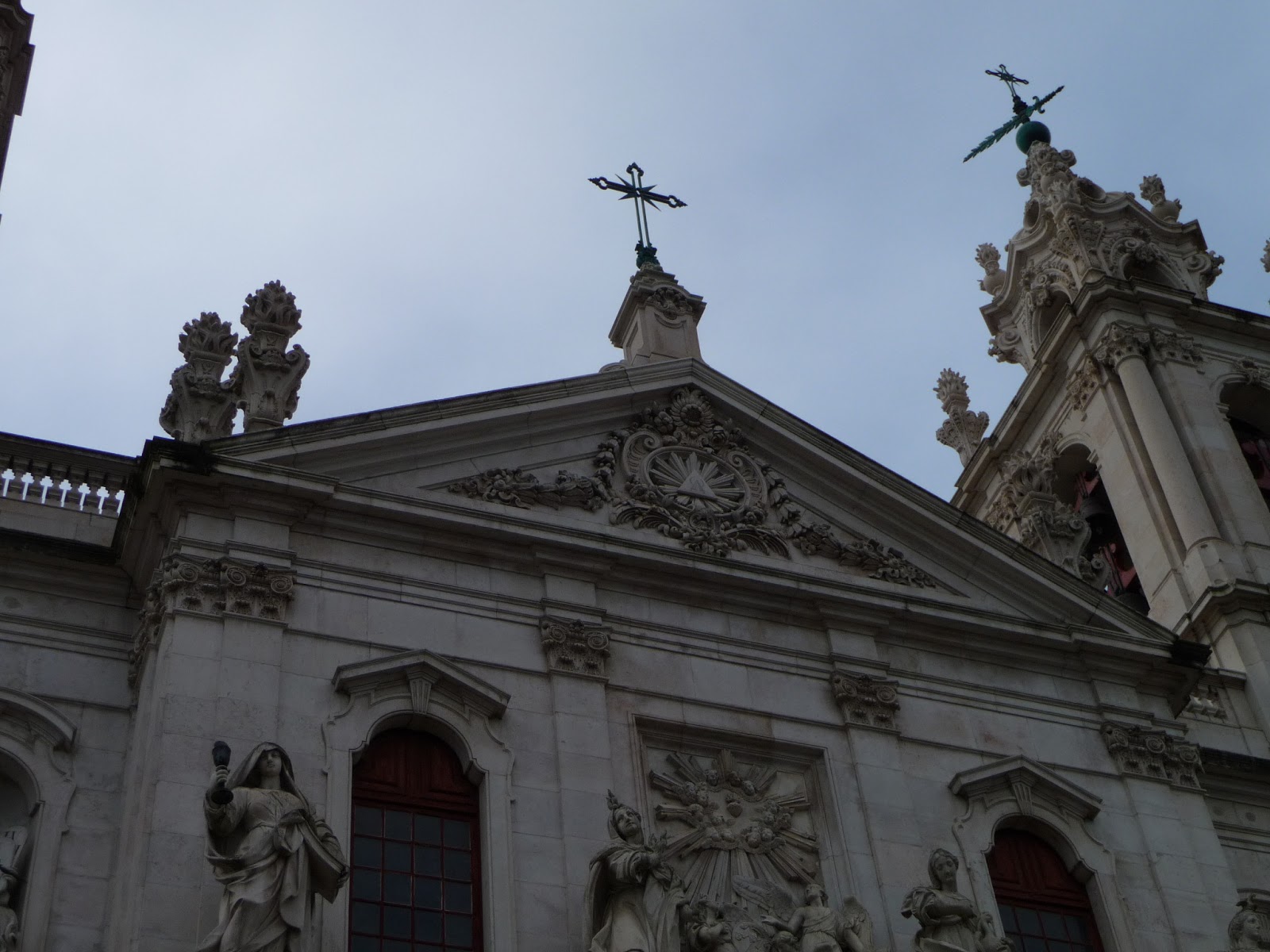
Nevertheless these are some of my "Looking Up" photos...
Subscribe to:
Posts (Atom)